Global Internet Adoption & Digital Growth Analysis

姜智浩 Lv4

数据来源

https://www.kaggle.com/datasets/sudipde25/global-internet-adoption-trends/data

说明

此数据集主要为探索 以可视化为主

1
2
3
4
5
6
7
8
9
10
11
12
13
14
15
16
17
18
import pandas as pd
import numpy as np
import seaborn as sns
import matplotlib.pyplot as plt
%matplotlib inline

from matplotlib import font_manager
# 设置字体路径
font_path = '/System/Library/Fonts/STHeiti Medium.ttc'

# 加载字体
my_font = font_manager.FontProperties(fname=font_path)

# 设置为默认字体
plt.rcParams['font.family'] = my_font.get_name()
plt.rcParams['axes.unicode_minus'] = False # 正确显示负号

colors = ['#d7fbe8','#9df3c4','#62d2a2','#1fab89','#a6d0e4', '#f9ffea', '#ffecda', '#d4a5a5', '#fbafaf', '#f2c6b4', '#f3e8cb', '#99e1e5']
  • Country 国家
  • Date 日期
  • Internet_Penetration (%) 互联网普及率(%)
  • Broadband_Speed (Mbps) 宽带速度(Mbps)
  • GDP_Per_Capita (USD) 人均GDP(美元)
  • Education_Level (%) 教育水平(%)
  • Mobile_Data_Usage (GB) 移动数据使用量(GB)
  • Digital_Investment (M USD) 数字投资(百万美元)
  • Digital_Literacy (%) 数字素养(%)
  • X_Sentiment_Score X情绪评分
  • 5G_Rollout 5G部署
  • Urban_Rural 城乡(城市/农村)
  • Latitude 纬度
  • Longitude 经度
  • Anomaly 异常

分析每月数据

1
2
3
df = pd.read_csv('global_internet_adoption_monthly_2010_2025_with_clusters.csv')
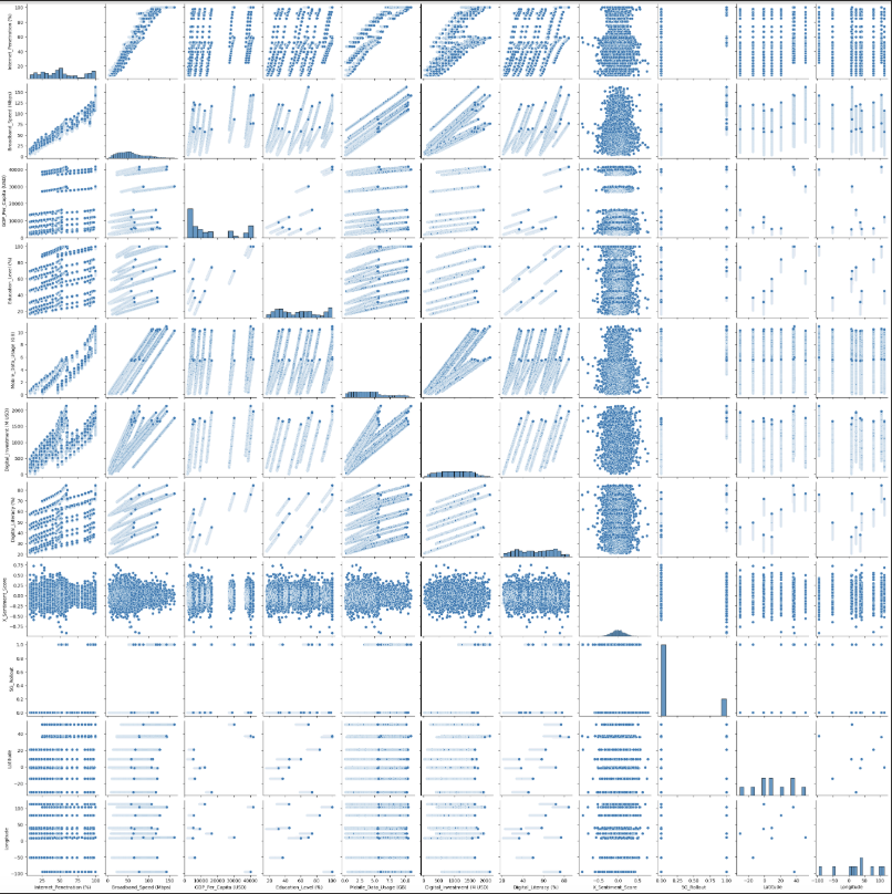
df['Date'] = pd.to_datetime(df['Date'])
1
2
3
sns.pairplot(df, diag_kind='hist')
plt.suptitle('EDA', y=1.02)
plt.show()

photo

1
2
3
4
5
6
7
8
9
10
11
12
13
14
15
16
17
18
19
20
21
22
23
24
25
26
27
28
import seaborn as sns
import matplotlib.pyplot as plt
import math

# 选出所有数值型列(排除 'Country')
num_cols = [col for col in df.columns if df[col].dtype in ['float64', 'int64']]

# 设置子图布局(比如每行显示2个图)
n_cols = 3
n_rows = math.ceil(len(num_cols) / n_cols)

# 设置图尺寸
fig, axes = plt.subplots(n_rows, n_cols, figsize=(6 * n_cols, 5 * n_rows))

# 若 axes 是 1D,需要变成 2D 统一处理
axes = axes.flatten()

for i, col in enumerate(num_cols):
sns.boxplot(data=df, x='Country', y=col, ax=axes[i], palette=colors)
axes[i].set_title(col)
axes[i].tick_params(axis='x', rotation=45)

# 多余的子图隐藏
for j in range(i+1, len(axes)):
fig.delaxes(axes[j])

plt.tight_layout()
plt.show()

photo

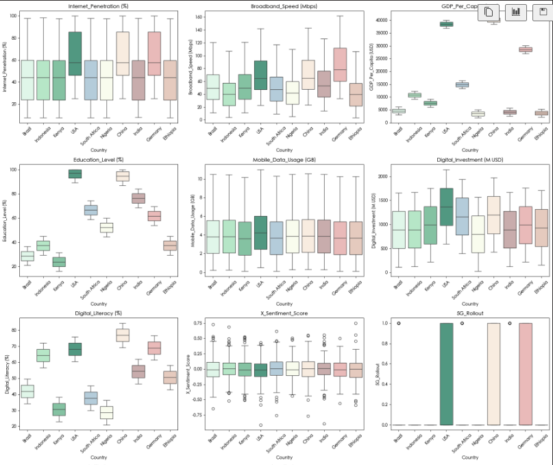
上述是不同国家的互联网相关的各项数据的箱线图

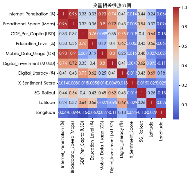
  • 从互联网普及率来看 中国 美国和德国的互联网普及率在一个水平 其他国家的在另一个水平 说明中国 美国和德国的互联网普及率较其他国家领先
  • 从宽带速度来看 各国的宽带速度有差别 但差别不算太大
  • 从国家GDP来看 各国的GDP的差别较大
  • 从教育水平来看 各国的教育水平有差别 与互联网普及率的关系不大
  • 从移动数据使用量来看 各国的移动数据使用量基本一致
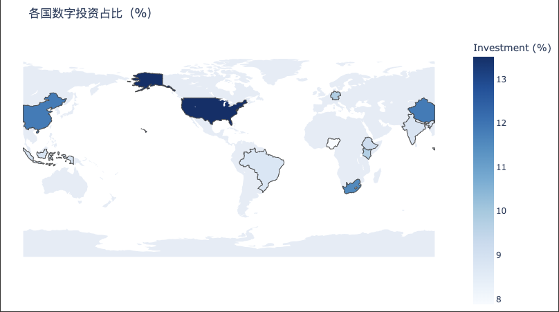
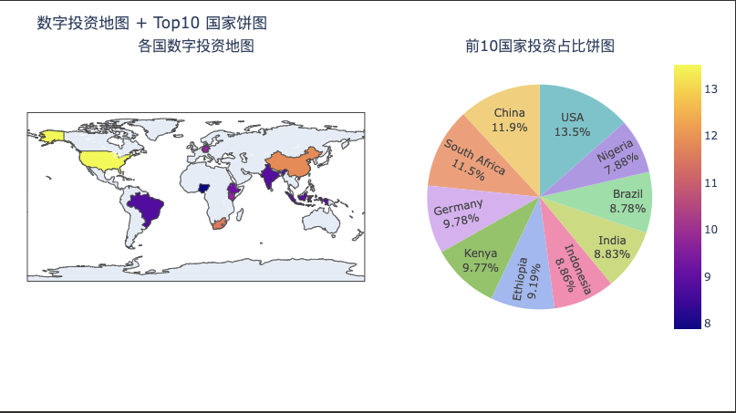
  • 从数字投资来看 各国的数字投资有差别 其中美国的数字投资最高 个人认为由于美国的互联网发展最早 了解其中的的投资回报率 并且可以投资的资金十分丰厚 所以其数字投资最高 第二高的是中国 由于中国作为世界第二大经济体 也了解其中的投资回报率 第三高的是南非 作为一个非洲国家 其互联网发展较晚 但是却有如此的投资 应该是因为作为一个发展中国家 要想在国际市场上获得成功 其要抓住机会 因此政府大力投资
  • 从数字素养来看 各国的数字素养有差别 数字素养的高低反应了国家互联网发展水平与先后关系
  • 从X情绪评分来看 各国的X情绪评分几乎一致
  • 从5G部署来看 各国的5G部署有差别 只有中国、美国和德国全面部署了5G 由于5G的部署需要大量的投资 因此只有少数国家负担得起 其他国家那些有5G的应该是私人部署
1
2
3
4
5
6
7
8
9
10
11
12
13
14
15
16
17
18
19
20
import plotly.express as px

fig = px.line(df, x='Date', y='Internet_Penetration (%)', color='Country',
title='Internet Penetration Over Time',
labels={'Internet_Penetration (%)': 'Internet Penetration (%)', 'Date': 'Date'})

# 设置图例放到图外右侧
fig.update_layout(
legend_title_text='Country',
legend=dict(
x=1.05,
y=1,
xanchor='left',
yanchor='top',
bgcolor='rgba(0,0,0,0)', # 图例背景透明
),
margin=dict(r=150) # 右边距留够空间放图例
)

fig.show()

photo

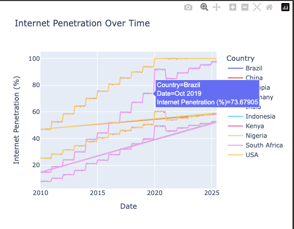
可以看到 随着时间的推移 互联网的普及率呈现阶梯式上升的趋势

不同国家的互联网普及率也有一定的差异 这是由于国家的发展导致的 有些国家发展得早 互联网普及率就高一些 有些国家发展得晚 互联网普及率就低一些

1
2
3
4
5
6
7
8
9
10
11
12
13
14
15
16
17
18
19
20
21
22
23
24
25
26
27
28
29
30
31
32
33
34
35
36
37
38
39
40
41
42
import matplotlib.pyplot as plt
import seaborn as sns


fig, axes = plt.subplots(2, 2, figsize=(14, 10))

# 城乡互联网渗透率
ax1 = axes[0, 0]
sns.lineplot(data=df, x='Date', y='Internet_Penetration (%)',
hue='Urban_Rural', ci=None, ax=ax1)
ax1.set_title("城乡互联网渗透率")
ax1.legend(title='Urban/Rural')

# 数字投资 vs GDP
ax2 = axes[0, 1]
sns.scatterplot(data=df, x='GDP_Per_Capita (USD)', y='Digital_Investment (M USD)',
hue='Country', ax=ax2, legend=False)
ax2.set_title("数字投资与人均GDP的关系")

# 各国互联网渗透率分布
ax3 = axes[1, 0]
sns.violinplot(data=df, x='Country', y='Internet_Penetration (%)',
palette=colors, ax=ax3)
ax3.set_title("各国互联网渗透率分布")
ax3.tick_params(axis='x', rotation=45)

# 饼图
ax4 = axes[1, 1]
investment_by_country = df.groupby('Country')['Digital_Investment (M USD)'].sum()
top10 = investment_by_country.sort_values(ascending=False).head(10)

ax4.pie(top10,
labels=top10.index,
autopct='%1.1f%%',
startangle=140,
colors=colors[:10],
wedgeprops={'edgecolor': 'white'})
ax4.set_title("国家数字投资占比")


plt.tight_layout()
plt.show()

photo

1
2
3
4
5
6
7
8
9
10
11
12
13
14
15
16
17
18
19
import plotly.express as px
import pandas as pd

df_map = df.groupby('Country', as_index=False)['Digital_Investment (M USD)'].sum()

df_map['Investment (%)'] = df_map['Digital_Investment (M USD)'] / df_map['Digital_Investment (M USD)'].sum() * 100

# 使用 Plotly 画 Choropleth 地图
fig = px.choropleth(df_map,
locations='Country',
locationmode='country names',
color='Investment (%)',
hover_name='Country',
color_continuous_scale='Blues',
title='各国数字投资占比(%)')

fig.update_geos(showframe=False, showcoastlines=False)
fig.update_layout(margin={"r":0,"t":50,"l":0,"b":0})
fig.show()

photo

1
2
3
4
5
6
7
8
9
10
11
12
13
14
15
16
17
18
19
20
21
22
23
24
25
26
27
28
29
30
31
32
33
34
35
36
37
38
39
40
41
42
43
44
45
46
47
import plotly.express as px
import plotly.graph_objects as go
from plotly.subplots import make_subplots


investment_by_country = df.groupby('Country')['Digital_Investment (M USD)'].sum()

top10 = investment_by_country.sort_values(ascending=False).head(10)
top10_percent = top10 / top10.sum() * 100 # 转为百分比


df_map = investment_by_country.reset_index()
df_map['Percent'] = df_map['Digital_Investment (M USD)'] / df_map['Digital_Investment (M USD)'].sum() * 100

# 创建 subplot: 1行2列,第1列地图,第2列饼图
fig = make_subplots(rows=1, cols=2,
column_widths=[0.6, 0.4],
specs=[[{"type": "choropleth"}, {"type": "domain"}]],
subplot_titles=("各国数字投资地图", "前10国家投资占比饼图"))


map_fig = px.choropleth(df_map,
locations='Country',
locationmode='country names',
color='Percent',
color_continuous_scale='Blues',
hover_name='Country')
for trace in map_fig.data:
fig.add_trace(trace, row=1, col=1)


fig.add_trace(go.Pie(
labels=top10.index,
values=top10.values,
hole=0,
textinfo='percent+label',
marker=dict(colors=colors),
), row=1, col=2)


fig.update_layout(
title_text="数字投资地图 + Top10 国家饼图",
showlegend=False,
margin=dict(t=60, l=30, r=30)
)

fig.show()

photo

1
2
3
4
plt.figure(figsize=(6, 5))
sns.heatmap(df.select_dtypes(include='number').corr(), annot=True, cmap='coolwarm', square=True)
plt.title("变量相关性热力图")
plt.show()

photo

  • Title: Global Internet Adoption & Digital Growth Analysis
  • Author: 姜智浩
  • Created at : 2025-06-05 11:45:14
  • Updated at : 2025-06-05 21:11:52
  • Link: https://super-213.github.io/zhihaojiang.github.io/2025/06/05/20250605Global Internet Adoption & Digital Growth Analysis/
  • License: This work is licensed under CC BY-NC-SA 4.0.
On this page
Global Internet Adoption & Digital Growth Analysis